Best Phil Bourassa Batman design

Best Phil Bourassa Batman design

  • Justice League: Crisis on Two Earths

  • Young Justice season 1⁠—2

  • Justice League: Doom

  • Justice League: War⁠—Reign of the Supermen

  • Young Justice: Outsiders

  • Batman: Hush


Results are only viewable after voting.

ganon51

Member
Joined
Feb 26, 2012
Messages
555
Location
London, U.K.
For the past decade, Phil Bourassa has been the main character designer of DC's animations. Which Batman design of his do you like most?
018af8ac0e4cd6e0c35183e587bf5541.jpg
maxresdefault.jpg

Justice League: Crisis on Two Earths
latest

Young Justice season 1⁠—2
latest

Justice League: Doom
latest

Justice League: War⁠—Reign of the Supermen
young-justice-outsiders-triptych-2-740x431.jpg

Young Justice: Outsiders
380c0b4a388c2743b19748e6d1ce1523.jpg

Batman: Hush
 
I really dig the Crisis and Hush ones. They both feel like they have a bit more personality to them
 
As a reminder about the rules here, don't just list a title. Say why, please. A sentence will do.
 
YJs1 is up there with one of the few undie on the outside designs I actually like. Plus, I'm all for brass knuckle gloves and general regions of padding without overdoing it. That concept art is my de-facto go-to for when I think Bourassa.
 
I'm going with Batman: Hush since said costume is a much need departure from the usual black and grey costume and is a throwback to his navy and grey costume from the pre-Crisis era.
 
The ideal Batman for me will always be Jim Aparo style. Maybe because it was the first Batman I encountered as a kid but I just always loved it. This Batman was undeniably superheroic and the good guy but still looked intimidating enough in the light blue, grey and yellow that I wouldn't want to be one of the villains he was against. My favorite Batman designs tend to reminds me of that one in one way of another (TAS, Brave and the Bold).

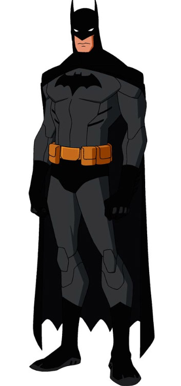
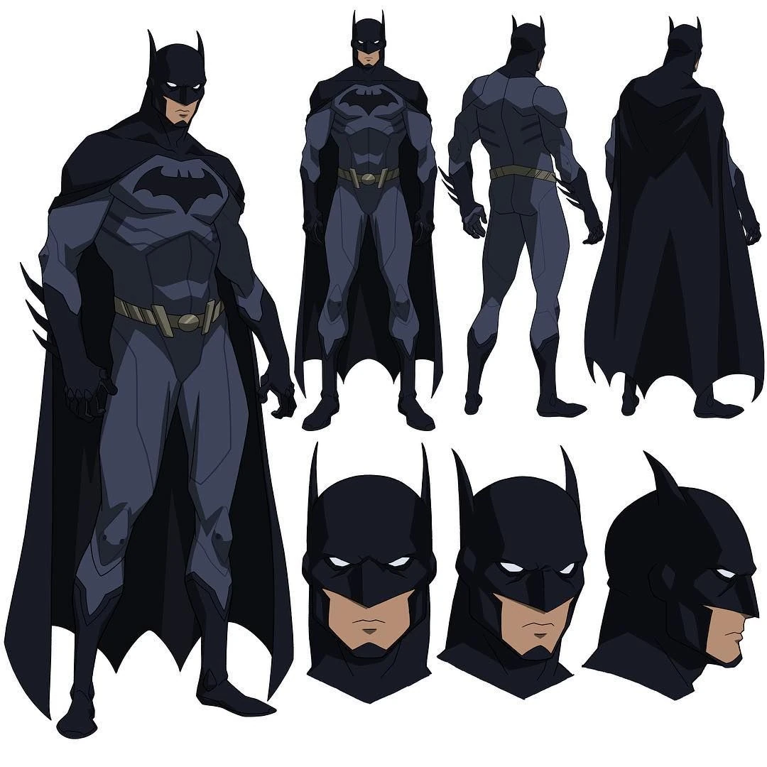
Of Bourassa's designs, the one that really comes close to my ideal is Young Justice season 1. It's not too beefy but built enough to look superheroic. He gives off the same vibe of not looking scary but intimidating enough for the people he needs to intimidate. It looks great when compared against all of the other major heroes like Superman, Wonder Woman and Flash and the colors help to contrast against them, too. The horn length is perfect. I love the detail of the body armor lines that match the show's aesthetic but also don't take away at all from being identifiably Batman. The yellow utility belt is also great since it breaks up the color scheme, along with the trunks, more than a gray belt or some other color might and without looking garish.

Sent from my SM-G960U using Tapatalk
 
Bourassa's Batman (Batmen? Batmans?) reminds me more of Neal Adam's Batman, but for many of the same reasons he brings Jim Aparo to mind for yourself. I can find something to like in each of Bourassa's designs.
 

Spotlight

Staff online

Who's on Discord?

Latest profile posts

To celebrate the fact that I got three weeks off from work for rest, I watched today the latest installment in the separate Minions series of movies. What I loved was the unique logo variation of the Universal logo, which was akin to the plot taking place in the late 1800s
HO00001571
Nicktoons in the US has recently aired something that no one expected: an AI generated ad for an overpriced plush toy.
Not everything from DC and Marvel comics needs to be more like the adaptations.
Woah yeah today is my Birthday!

Featured Posts

Back
Top